### Initialize SvelteKit or Svelte Project and Install Dependencies
Source: https://flowbite-svelte.com/docs/plugins/wysiwyg/pages/quickstart
These commands guide you through setting up a new SvelteKit or Svelte project using `npx sv create` or `npm create vite`, followed by navigating into the project directory and installing initial dependencies with `pnpm install`.
```bash
npx sv create my-app
cd my-app
pnpm install
```
```bash
npm create vite@latest myapp -- --template svelte
cd myapp
pnpm install
```
--------------------------------
### Install Flowbite Svelte Core and Icons
Source: https://flowbite-svelte.com/docs/plugins/wysiwyg/pages/quickstart
These commands install the main Flowbite Svelte library and its dependencies, along with the optional `flowbite-svelte-icons` package, which is recommended for full example functionality and icon support.
```bash
pnpm i -D flowbite-svelte flowbite
```
```bash
pnpm i -D flowbite-svelte-icons
```
--------------------------------
### Install Tailwind CSS and Run Development Server
Source: https://flowbite-svelte.com/docs/plugins/wysiwyg/pages/quickstart
This snippet demonstrates how to add Tailwind CSS to your Svelte project using `npx sv add tailwindcss`, install its dependencies, and then start a local development server to preview your application.
```bash
npx sv add tailwindcss
pnpm install
```
```bash
pnpm dev
```
--------------------------------
### Import and Use Flowbite Svelte Component
Source: https://flowbite-svelte.com/docs/plugins/wysiwyg/pages/quickstart
This Svelte code example demonstrates how to import a component, specifically the `Alert` component, from the `flowbite-svelte` library and use it within your Svelte page. It includes basic styling and content to display an informational alert.
```svelte
Info alert!
Change a few things up and try submitting again.
```
--------------------------------
### Install Flowbite Svelte Icons (Optional)
Source: https://flowbite-svelte.com/docs/plugins/wysiwyg/pages/introduction
This optional command installs the Flowbite Svelte Icons library as a development dependency, which is required for some examples and provides a set of icons for your application.
```bash
pnpm i -D flowbite-svelte-icons
```
--------------------------------
### Install Flowbite Svelte Dependencies
Source: https://flowbite-svelte.com/docs/plugins/wysiwyg/pages/introduction
This command installs the core Flowbite Svelte and Flowbite libraries as development dependencies into your project, enabling the use of Flowbite components.
```bash
pnpm i -D flowbite-svelte flowbite
```
--------------------------------
### Install Flowbite Svelte Chart Plugin
Source: https://flowbite-svelte.com/docs/plugins/wysiwyg/plugins/charts
Instructions for installing the `@flowbite-svelte-plugins/chart` package using pnpm, a prerequisite for using Flowbite Svelte chart components.
```bash
pnpm i -D @flowbite-svelte-plugins/chart
```
--------------------------------
### Accessing Flowbite Svelte Documentation for AI Prompts
Source: https://flowbite-svelte.com/docs/plugins/wysiwyg/pages/ai-integration
This JavaScript example demonstrates how to fetch Flowbite Svelte component documentation in markdown format from a specific URL. The retrieved markdown content is then incorporated into a prompt string, illustrating how AI assistants can be fed structured documentation to generate code examples or provide information based on official project resources.
```JavaScript
// Accessing component documentation in markdown format
const buttonDocs = await fetch("https://flowbite-svelte.com/docs/components/buttons.md").then((res) => res.text());
// Using markdown documentation in a ChatGPT prompt
const chatGptPrompt = `Based on this Flowbite Svelte Button component documentation:
${buttonDocs}
Generate a code example for a primary button with a link to '/about'.`;
```
--------------------------------
### Run Local Development Server
Source: https://flowbite-svelte.com/docs/plugins/wysiwyg/pages/introduction
This command starts a local development server for the Svelte project, allowing you to preview your application in a browser.
```bash
pnpm dev
```
--------------------------------
### Initialize Svelte Project with Vite
Source: https://flowbite-svelte.com/docs/plugins/wysiwyg/pages/introduction
This snippet shows how to quickly set up a new Svelte project using Vite, navigate into the project directory, and install its dependencies using `pnpm`.
```bash
npm create vite@latest myapp -- --template svelte
cd myapp
pnpm install
```
--------------------------------
### Setup Flowbite Svelte Device Mockup Component
Source: https://flowbite-svelte.com/docs/plugins/wysiwyg/components/device-mockups
Instructions for importing the DeviceMockup component from the Flowbite Svelte library into your Svelte application.
```Svelte
```
--------------------------------
### Initialize SvelteKit Project
Source: https://flowbite-svelte.com/docs/plugins/wysiwyg/pages/introduction
This snippet provides the commands to create a new SvelteKit application using `npx sv create`, navigate into the project directory, and install its dependencies using `pnpm`.
```bash
npx sv create my-app
cd my-app
pnpm install
```
--------------------------------
### Install vite-plugin-tailwind-purgecss
Source: https://flowbite-svelte.com/docs/plugins/wysiwyg/pages/faq-and-tips
This command installs `vite-plugin-tailwind-purgecss` as a development dependency. This plugin is essential for purging unused CSS from Tailwind CSS, significantly reducing the final bundle size of a SvelteKit application.
```Shell
pnpm i -D vite-plugin-tailwind-purgecss
```
--------------------------------
### Setup Flowbite Svelte Indicator Component
Source: https://flowbite-svelte.com/docs/plugins/wysiwyg/components/indicators
This snippet demonstrates how to import the `Indicator` component from the `flowbite-svelte` library, which is the first step to using it in a Svelte application.
```Svelte
```
--------------------------------
### Install Flowbite-Svelte WYSIWYG Text Editor with pnpm
Source: https://flowbite-svelte.com/docs/plugins/wysiwyg/plugins/wysiwyg
This command installs the Flowbite-Svelte WYSIWYG text editor plugin, along with its dependencies `lowlight` and `@tiptap/core`, using pnpm. It specifies the latest version for the text editor and a beta version for TipTap, which contains breaking changes.
```pnpm
pnpm i -D @flowbite-svelte-plugins/texteditor@latest lowlight @tiptap/core@3.0.0-beta.24
```
--------------------------------
### Install Tailwind CSS in Svelte Project
Source: https://flowbite-svelte.com/docs/plugins/wysiwyg/pages/introduction
This snippet provides the commands to install Tailwind CSS into an existing Svelte project using `npx sv add tailwindcss` and then install the necessary dependencies with `pnpm`.
```bash
npx sv add tailwindcss
pnpm install
```
--------------------------------
### Implement Simple Previous/Next Navigation with PaginationNav in Svelte
Source: https://flowbite-svelte.com/docs/plugins/wysiwyg/components/pagination
This Svelte example demonstrates a simplified `PaginationNav` component used for basic 'Previous' and 'Next' navigation without displaying individual page numbers. It shows how to use the `layout="navigation"` prop and includes examples for both default and large sizes.
```Svelte
```
--------------------------------
### Display Laptop Mockup in Svelte
Source: https://flowbite-svelte.com/docs/plugins/wysiwyg/components/device-mockups
This example illustrates how to use the DeviceMockup component to display a screenshot of your application within a laptop mockup. It's ideal for demonstrating desktop or web application interfaces.
```Svelte
```
--------------------------------
### Basic Svelte Card with Title and Description
Source: https://flowbite-svelte.com/docs/plugins/wysiwyg/components/card
This example shows a simple `Card` component with a title and a paragraph of text. It also demonstrates how to make the entire card a clickable link by setting the `href` prop.
```Svelte
Noteworthy technology acquisitions 2021
Here are the biggest enterprise technology acquisitions of 2021 so far, in reverse chronological order.
```
--------------------------------
### Implement Timeline Stepper in Svelte
Source: https://flowbite-svelte.com/docs/plugins/wysiwyg/components/stepper
This example illustrates the usage of the `TimelineStepper` component from `flowbite-svelte` to present steps in a timeline format. Each step can include a `label`, `description`, and `status`, allowing for a detailed visual representation of progress.
```Svelte
```
--------------------------------
### Set Progressradial Starting Position in Svelte
Source: https://flowbite-svelte.com/docs/plugins/wysiwyg/extend/progressradial
This example illustrates how to change the starting point of the `Progressradial` component's progress bar. The `startingPosition` prop allows you to orient the beginning of the progress from different cardinal directions (top, right, bottom, left).
```Svelte
```
--------------------------------
### Svelte Video Player with Muted Autoplay
Source: https://flowbite-svelte.com/docs/plugins/wysiwyg/components/video
This example combines the `autoplay` and `muted` attributes to automatically start the video without sound. This is useful for background videos or when sound is not immediately desired.
```Svelte
```
--------------------------------
### Utilize Blur Transition Effect for Svelte Toasts
Source: https://flowbite-svelte.com/docs/plugins/wysiwyg/components/toast
This Svelte example illustrates how to apply the blur transition to toast components. It shows how to configure the blur amount and introduce a delay before the transition starts, enhancing the visual presentation of notifications with a subtle effect.
```Svelte
{#snippet icon()}
{/snippet}
Transition type: blur, amount: 10
{#snippet icon()}
{/snippet}
Transition type: blur, amount: 50, delay 1000
```
--------------------------------
### Apply Solid Background to Flowbite Svelte Navbar
Source: https://flowbite-svelte.com/docs/plugins/wysiwyg/components/navbar
This Svelte example demonstrates how to change the default transparent background of the Flowbite Svelte Navbar component to a solid color using Tailwind CSS classes. It shows a basic Navbar setup with navigation links and a custom background.
```Svelte
FlowbiteHomeAboutNavbarPricingContact
```
--------------------------------
### Get and Set Text Editor Content in Svelte
Source: https://flowbite-svelte.com/docs/plugins/wysiwyg/plugins/wysiwyg
This Svelte example demonstrates how to retrieve the current HTML content from a Flowbite-Svelte TextEditor instance and how to programmatically update its content using the editor's commands. It showcases basic interaction with the editor's state.
```Svelte
```
--------------------------------
### Implement Informational Banner with CTAs in Svelte
Source: https://flowbite-svelte.com/docs/plugins/wysiwyg/components/banner
This Svelte example shows how to create an informational banner with a heading, a descriptive paragraph, and two call-to-action buttons. It utilizes Flowbite Svelte's `Banner` and `Button` components, along with icons for visual enhancement, to convey important messages and guide user actions.
```Svelte
Integration is the key
You can integrate Flowbite with many tools to make your work even more efficient and lightning fast based on Tailwind CSS.
```
--------------------------------
### Toggle Invisible Characters in Svelte Text Editor
Source: https://flowbite-svelte.com/docs/plugins/wysiwyg/plugins/wysiwyg
This example illustrates the use of the `InvisibleButtonGroup` component to control the visibility of invisible elements (like line breaks) within a Svelte text editor. It provides functions to get and set the editor's HTML content, demonstrating how to manage non-rendering characters.
```Svelte
```
--------------------------------
### Importing Flowbite Svelte Table Components for Setup
Source: https://flowbite-svelte.com/docs/plugins/wysiwyg/components/table
This Svelte snippet illustrates the essential imports required from `flowbite-svelte` to begin using table components. It includes `Table`, `TableBody`, `TableBodyCell`, `TableBodyRow`, `TableHead`, `TableHeadCell`, `Checkbox`, and `TableSearch`, providing the foundational elements for building interactive tables.
```Svelte
```
--------------------------------
### Integrate Bubble Menu in Svelte Text Editor
Source: https://flowbite-svelte.com/docs/plugins/wysiwyg/plugins/wysiwyg
This example illustrates how to add a contextual bubble menu to a Svelte text editor using the `@flowbite-svelte-plugins/texteditor` library. The bubble menu appears near selected text, providing quick access to formatting options. It also includes utility functions for getting and setting the editor's content.
```Svelte
```
--------------------------------
### Generate Component Documentation and Props JSON for Flowbite Svelte
Source: https://flowbite-svelte.com/docs/plugins/wysiwyg/pages/how-to-contribute
This command updates prop files by generating component documentation for all Svelte files within the `src/lib` directory and creating JSON files with props information, placing them in the `routes/component-data` directory. This is crucial for maintaining up-to-date component documentation.
```Shell
pnpm svelte-helpers
```
--------------------------------
### Implement Default Flowbite Svelte Footer
Source: https://flowbite-svelte.com/docs/plugins/wysiwyg/components/footer
This example shows a basic footer implementation using `flowbite-svelte`. It includes a copyright notice and a group of navigation links, demonstrating how to structure a simple footer with essential information.
```Svelte
```
--------------------------------
### Implementing a Responsive Default Sidebar in Svelte
Source: https://flowbite-svelte.com/docs/plugins/wysiwyg/components/sidebar
This comprehensive example demonstrates how to create a responsive sidebar with menu items, icons, and labels using Flowbite Svelte components. It includes state management for active URLs and sidebar visibility, dynamic icon rendering via snippets, and integration with `flowbite-svelte-icons` for a visually rich navigation experience.
```Svelte
```
--------------------------------
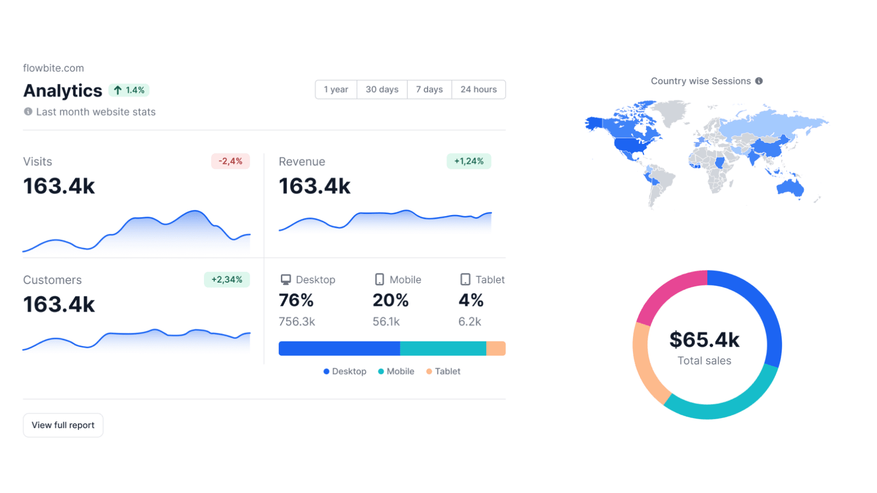
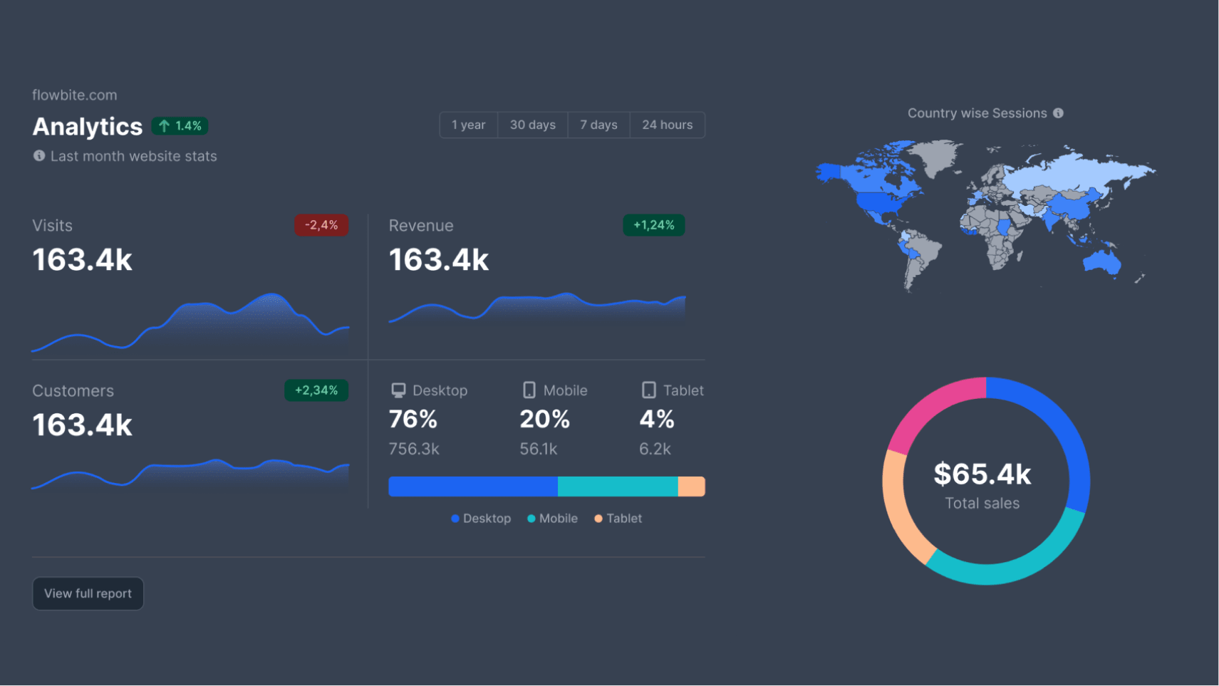
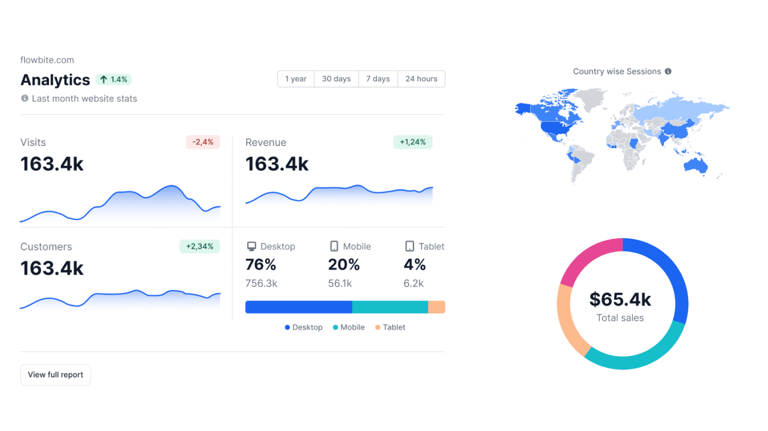
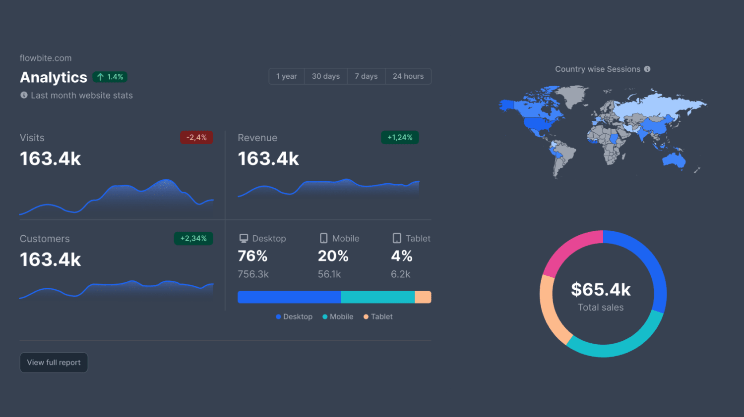
### Display Application Preview in Desktop Mockup (Svelte)
Source: https://flowbite-svelte.com/docs/plugins/wysiwyg/components/device-mockups
This Svelte code snippet demonstrates how to use the `DeviceMockup` component from `flowbite-svelte` to display an application preview within a desktop device frame. It includes both light and dark mode image examples for responsive display.
```Svelte
```
--------------------------------
### Install Flowbite Svelte Datatable Plugin
Source: https://flowbite-svelte.com/docs/plugins/wysiwyg/plugins/datatables
This snippet demonstrates how to install the Flowbite Svelte datatable plugin using pnpm, a fast package manager. This is the first step to integrate the datatable functionality into a Svelte project.
```pnpm
pnpm i -D @flowbite-svelte-plugins/datatable
```
--------------------------------
### Create Masonry Grid Layout with Svelte
Source: https://flowbite-svelte.com/docs/plugins/wysiwyg/components/gallery
This example demonstrates how to implement a four-column masonry grid layout using the `Gallery` component from `flowbite-svelte`. It initializes four separate arrays of image data and renders them within a responsive grid, suitable for displaying multiple image sets in a dynamic layout.
```Svelte
```
--------------------------------
### Conventional Commit Message Examples
Source: https://flowbite-svelte.com/docs/plugins/wysiwyg/pages/how-to-contribute
Examples of conventional commit messages used in the Flowbite Svelte project. These follow the Conventional Commits specification, categorizing changes like features, fixes, chores, documentation, style, and tests. A '!' indicates a breaking change, leading to a minor version bump.
```Shell
feat: add rating component
fix: add if statement to Button component
chore: clean up About page
docs: add timeline page
style: update home page
test: add modal test
```
```Shell
feat!: add drawer component and page
```
```Shell
git commit -a "feat: change btnClass name to bClass" -m "BREAKING CHANGE: change the Button component attributes"
```
--------------------------------
### Implement Simple Previous/Next Buttons with PaginationItem in Svelte
Source: https://flowbite-svelte.com/docs/plugins/wysiwyg/components/pagination
This Svelte example illustrates how to use individual `PaginationItem` components to create simple 'Previous' and 'Next' buttons. It demonstrates attaching `onclick` handlers to these items and shows examples for both default and large sizes, providing basic navigation controls.
```Svelte
PreviousNext
PreviousNext
```
--------------------------------
### Importing Flowbite Svelte Sidebar Components
Source: https://flowbite-svelte.com/docs/plugins/wysiwyg/components/sidebar
This snippet demonstrates how to import the necessary components from the `flowbite-svelte` library to set up a sidebar. It includes imports for the main `Sidebar` component and various sub-components like `SidebarBrand`, `SidebarItem`, and `SidebarDropdownItem`, which are essential for building a complete sidebar navigation.
```Svelte
```
--------------------------------
### Svelte Tags Component Example with Form Binding
Source: https://flowbite-svelte.com/docs/plugins/wysiwyg/extend/tags
This example demonstrates a practical implementation of the `Tags` component within a Svelte form. It shows how to bind the component's value to a reactive array (`tags`), display the JSON representation of the entered tags, and handle form submission with a button click.
```Svelte
```
--------------------------------
### Configure Tailwind CSS and Flowbite Plugin in CSS
Source: https://flowbite-svelte.com/docs/plugins/wysiwyg/pages/quickstart
This CSS configuration block, typically placed in `src/app.css` for SvelteKit, imports Tailwind CSS, enables the Flowbite plugin, defines custom dark mode variants, and sets up custom primary and secondary color palettes for theme customization. It also includes source paths for Flowbite Svelte components and icons.
```css
@import "tailwindcss";
@plugin 'flowbite/plugin';
@custom-variant dark (&:where(.dark, .dark *));
@theme {
--color-primary-50: #fff5f2;
--color-primary-100: #fff1ee;
--color-primary-200: #ffe4de;
--color-primary-300: #ffd5cc;
--color-primary-400: #ffbcad;
--color-primary-500: #fe795d;
--color-primary-600: #ef562f;
--color-primary-700: #eb4f27;
--color-primary-800: #cc4522;
--color-primary-900: #a5371b;
--color-secondary-50: #f0f9ff;
--color-secondary-100: #e0f2fe;
--color-secondary-200: #bae6fd;
--color-secondary-300: #7dd3fc;
--color-secondary-400: #38bdf8;
--color-secondary-500: #0ea5e9;
--color-secondary-600: #0284c7;
--color-secondary-700: #0369a1;
--color-secondary-800: #075985;
--color-secondary-900: #0c4a6e;
}
@source "../node_modules/flowbite-svelte/dist";
@source "../node_modules/flowbite-svelte-icons/dist";
@layer base {
/* disable chrome cancel button */
input[type="search"]::-webkit-search-cancel-button {
display: none;
}
}
```
--------------------------------
### Build a Pricing Plan Card in Svelte
Source: https://flowbite-svelte.com/docs/plugins/wysiwyg/components/card
This example illustrates how to construct a pricing card using Flowbite Svelte's `Card` and `Button` components, along with icons. It details how to display pricing, features (including available and unavailable ones), and a call-to-action button.
```Svelte
Standard plan
$49/month
2 team members
20GB Cloud storage
Integration help
Sketch Files
API Access
Complete documentation
24×7 phone & email support
```
--------------------------------
### Adjusting Input Sizes in Flowbite Svelte
Source: https://flowbite-svelte.com/docs/plugins/wysiwyg/components/forms
This Svelte example demonstrates how to control the size of the `Input` component using the `size` prop. It shows examples for large (`lg`), default (`md`), and small (`sm`) input fields, utilizing `Label` and `Input` components from `flowbite-svelte` to create varied input appearances.
```Svelte
```
--------------------------------
### Import Flowbite Svelte Pagination Components
Source: https://flowbite-svelte.com/docs/plugins/wysiwyg/components/pagination
This snippet demonstrates how to import the necessary pagination components (`PaginationNav`, `Pagination`, `PaginationItem`) from the `flowbite-svelte` library into a Svelte component. This is the initial setup required before using any pagination features.
```Svelte
```
--------------------------------
### Implement Default Flowbite Svelte Rating with Stars
Source: https://flowbite-svelte.com/docs/plugins/wysiwyg/components/rating
This example shows how to use the `Rating` component with default star icons. It demonstrates setting the `total` number of stars, the `size` of the stars, and the `rating` value. It also includes an example of customizing the star icon's fill and stroke colors using a wrapper function for advanced styling.
```Svelte
```
--------------------------------
### Setup Flowbite Svelte Toast Component
Source: https://flowbite-svelte.com/docs/plugins/wysiwyg/components/toast
This snippet demonstrates the basic import statement required to use the Toast component from the Flowbite Svelte library in a Svelte application. It's the foundational step before utilizing any toast functionalities.
```Svelte
```
--------------------------------
### Flowbite Svelte Component Usage Example in Svelte
Source: https://flowbite-svelte.com/docs/plugins/wysiwyg/pages/colors
This Svelte code example showcases the integration and usage of various Flowbite Svelte components such as Button, Alert, Card, Navbar, NavBrand, NavLi, NavUl, NavHamburger, and Toast. It demonstrates how to import components and icons, pass props like `color` and `href`, and structure UI elements within a Svelte application, including a slot for custom icon content.
```Svelte
Secondary
Noteworthy technology acquisitions 2021
Here are the biggest enterprise technology acquisitions of 2021 so far, in reverse chronological order.
FlowbiteHomeAboutServicesPricingContact
{#snippet icon()}
{/snippet}
Dismissable user notification.
```
 Flowbite